History and Futures

Morag Myerscough
Belonging Bandstand

Morag’s amazing mobile installation of a bright, bold, touring bandstand was exhibited across Sussex for communities to engage and reflect on the concept of ‘belonging’ through creating placards that made it’s crown and was the base for a diverse range of local performers to use as a stage. This bandstand toured throughout East Sussex in 8 locations from Brighton, Ditching, Lewes, Newhaven, Hastings, and many more places.
This concept was a beautiful idea to bring communities together showing the belonging of one and another with this open and free for all entertainment venue for everyone to enjoy. I love the bold and bright placards as they identify the individuals of the communities it touches throughout its journey of this installation.
21st Century Victorian
Joby Carter Fairground Sign Writing
An amazing and passionate story of the art of Fairground SignWriting of Joby Carter talking about a unique art form that has been dying out, but has found fresh enthusiasm and keen interest with a new generation of restoration of traditional fairground rides. Joby shows a great passion for what he does best and producing hand signwriting is a special craft to many and the unique touch of creating these beautiful signs of art really brought my attention. The scale of things he can produce really doesn’t phase his skill and technique however big the job can be. He’s truly a remarkable character as well as a handy signwriter.
Noramoji Project
This project is lovely to watch and really reflects this brief we are working on. The project looks into signage in the community which this video takes somewhere in Japan. There are so many signs to be seen but this project is focused on individual shop owners to have their signage letterforms to be recreated and given to them as their identity. This brings a great connection between community and shop owners identity to show an area they live in that is congested with so much collateral.
Workshop Challenge
This week’s challenge was a great exercise in observing letterforms that identify the characteristic of the local area we live in. I’ve kept within 2 miles radius in my location and searched high and low for letterforms that give the unique sign of Bexhill-On-Sea.
There’s a good mixture of historical to contemporary letterforms that are serif and san serif that shows the period of when these were formed. I really enjoyed the exploration of finding these and feel these justify the rise of how the town was formed. Many of these images are from churches, pubs, shops, road signs, building names, and B&B.


This is my root I took to look for letterforms which if I could have, loved to video my journey to show you all what I truly saw along my path.

These are a closer look into the letterforms that I’ve discovered and really looking into them shows a mixture of historical and contemporary design and starting to see some interesting features. Hopefully, this can determine my selection of the five I feel will show the strong characteristics of my town Bexhill-On-Sea.

Final 5ive Selection

St Mary Magdalene’s Church, Magdalene Road,
Bexhill-on-Sea, TN40 1RH
This gothic font style seems century’s old and would think this Parish Catholic Church would be centuries old but my research suggests this building is a gothic revival style, built 1907. The letterform still gives a great historical character to the place of worship which is contrary to the context than rather the physical building itself. Maybe this doesn’t give the real characteristic of what Bexhill is about today but shows the historical values and culture on the importance of religious belief to people in the area of town.

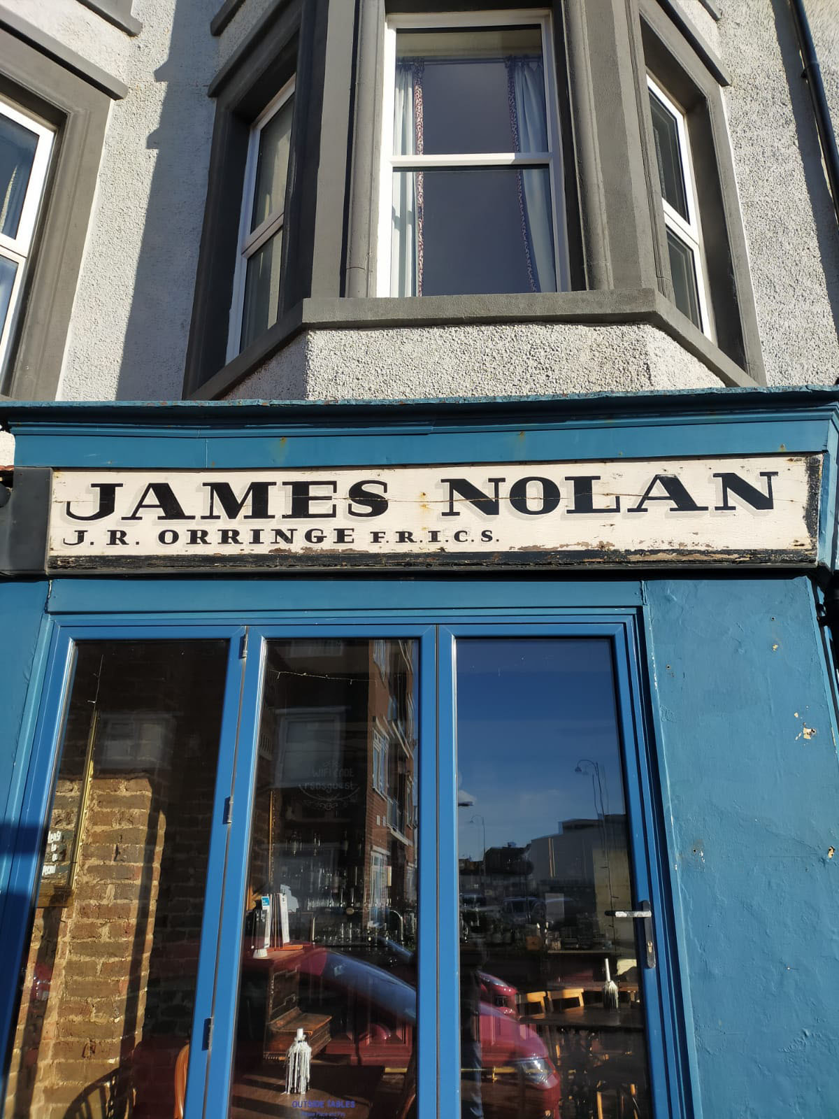
57A Western Road, Bexhill-on-Sea, TN40 1DT
This signage is placed on the doorstep of a shop that was a small drapery business many years ago which has changed to a charity shop. I’m not too sure how far back this may be but I love the uniqueness of this mosaic signage. The craft looks absolutely amazing as the tiles are considered carefully for the letterforms to take shape with the rest of the mosaic tiles. The font looks to be very similar to the Trajan Pro typeface, but the apex on the ‘A’ looks very different from the typeface.

18 Endwell Rd, Bexhill-on-Sea TN40 1EA
The first thing that caught my eye was the way the paint covered the typeface to hide it from being seen than rather being removed. This vintage letterform shows characteristics of breaking away from the common serif fonts at its time it was created with this softer and artistic style of a wordmark that’s suited for a business. It dates back to 1922 where this building was a shop for selling stationery, leather bags, calendars etc. all sorts of goods for locals to buy. The letter ‘N’ wavey shape is something I’ve seen in some forms of typography in today’s practice that stood out for me to chose this letterform.

Rother Community Hub, Bexhill-on-Sea TN40 1RG
The Old Bank Chamber was built in 1890 and is the community hub of Bexhill. This letterform really drew my attention as you can see the craft was carved into the concrete of the building, which the sign is set in stone well before the signage on the side saying ‘Rother Community’. At the turn of the modernism movement in the early 20th century, paved way for this letterform as it exploded onto the scene Sans Serif fonts wasn’t as popular as Serif fonts. The typeface structure is very sharp and straight-edged and likes how the letter ‘A’ has lost part of its form but still there in the groove of the sandstone that brings heritage with it.

De La Warr Pavilion, Marina, Bexhill-on-Sea TN40 1DP
This is one of my favourite places in Bexhill, which is the De La Warr Pavilion. This building has been around since 1935, with it’s impressive Art Deco architecture that shapes this beautiful building. You could say the letterform would have been expected in the style of the period it was built but the reality is the modernist approach in creating a letterform that is timeless to reflect the space and people who live there.