Typography


My Reflection
Kristoffer Soelling from Regular Practice lecture on typography was a really great watch. I really enjoyed understanding more on Type and Press discussing how type has shaped design and tied together with technology. When the invention of movable type was brought to this world it allowed us to create forms and shapes in crafting type, which we were allowed to print. This had some tricky problems at the beginning of printing text but became adjustable in using certain tools like a galley and printing cases to help and organise to typeset lines of paragraphs for print. The technique is an old tradition of typesetting and is still use today even though we have technology that can fulfill these outcomes. The talk carried on with a brief history in Linotype machines, electroset sheet, paste-up, font discs and offset printing that we know today in the digital form of printing. I really enjoyed the brief history of how type formed design today through a series of different print methods that evolved over centuries by old and new technology.
Type and Design aesthetics were discussed how the type of terminology helps us understand the form and shape of the typeface, which we can apply to shape our designs. I found it very interesting how Kristoffer discussed how letterforms can identify and differentiate meanings as to where they typeface comes from. In saying this we should take good consideration of how the connotation of type is applied to its context. Dadaism was the beginning of an art form in type that allowed designers to illustrate and mix up compositions in text. This drawn type to become something that you see, but become something that is invisible. The Bauhaus movement founded many great designers such as Herbert Bayer, and Jan Tschichold before the beginning of the second world war. Many German designers fled Germany because the school was closed by the Nazis and moved to Switzerland for a new beginning. It was Otl Aicher, the founder of Ulm School of Design which the beginning of the Grid System for forms and shape of how typography is designed and how type can be set. This was a revolutionary movement for type to be expressed in forms for many languages in a single design process. This Grid System we as designers today use to help us function the form of our design but also allow us to push the boundaries to its limitation.
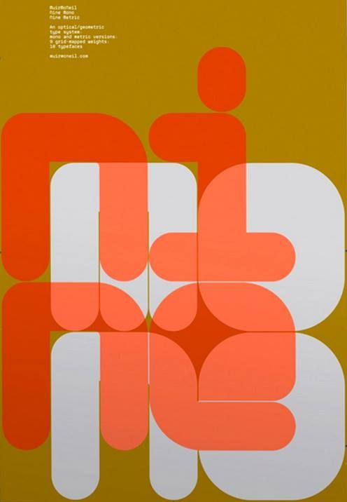
This brings me to the styles of swiss designer Wolfgang Weingart that really changed the graphic design world by creating playful type that broke the Grid System. His work was all about the form of experimentation and allowed other designers to be influenced in creating a more lateral approach in type and design. I really love his work as Weingart designs are a more experimental and expressive approach to typography. It showed deliberate carelessness and inherently rebellious nature in his work that he expressed in his professional development.
Wolfgang Weinbert


This lead to influencing many designers in the near future such as Neville Brody, 8vo, and David Carson. These contemporary designers moved forward this careless and rebellious approach to the fundamental grid system of typography. Neville Brody is far the most interesting work for me as I’ve grown to enjoy his design through my education and inspired me to follow a career as a graphic designer. I want to start exploring more in my approach in typography through being more expressive and playful in design that I can learn to break new boundaries for my own personal goals.
8vo (The Paste Up)


Neville Brody


Workshop Challenge
This week’s challenge is to take an excerpt from a poet or writer and translate it into a new typographic form. Take the first line of the poem and draw it, typeset it and build it, which then uses the body of the text and typeset it. When designing the piece, we should consider key questions to our brief when creating this piece:
- How does leading, positioning, stress on particular words, and detailing affect the power of the piece?
- How is meaning affected by interpretation in a tangible way?
- What is the relationship between the page?
For my choice of a poem, I went for was from the contemporary spoke on word artist, poet, rapper, and podcast host George the Poet. I chose one of his earlier pieces called ‘ Mother Tongue’ which is a great poem that he speaks about how growing up wasn’t fair as not knowing his parent’s mother tongue of Uganda. He speaks up about the disconnection that brings upon himself and the culture of his parent’s country and missing the opportunity to learn about his inheritance. All this was down to advising from medical professions not to teach him as they thought it can be too confusing. Below is the full poem of ‘Monther Tongue’:

I came across another poet by the name of George Watsky that I was torn to choose between which 2 poems that I wanted to depict. Watsky poem called ‘S for Lisp’ which I really enjoyed and got me thinking in designing a piece on his first line ‘Somebody said to me the other day I’ve got a lisp’. The video below shows the full poem which I also really enjoyed.
Draw it, typeset it and build it
I first sketched some ideas away from the computer to help to look at this project from a different perspective for my piece to develop. I found this approach very flexible in jotting ideas together and being more productive in doing this practice. Sometimes you can procrastinate when working on screen as your focus becomes less intense in what you doing.


Sketch to Screen Development


Ideas Wall
Weekly Reflection
This week was great as it was based on typography and loved learning more about the subject. The lecture by Kristoffer Soelling from Regular Practice gave a great in-depth discussion in the history of type and press, plus the relationship on type and design. The discussion on this lecture was fundamentally key to progressing my love for typography as I have gained a better understanding of the history of type. I mostly enjoyed looking at the work of Wolfgang Weingart, Neville Brody, Eightvo, Otl Aicher, Herbert Bayer, and Jan Tschichold as these are great influential graphic designers. Looking at their work gave a great motivation in wanting to do and know more about the area of typography which I want to explore more during my studies. Looking into the work of these designers have really pushed me to look more into their work and research further in their style and form of design that can influence my practice.
My workshop challenge this week was a great brief to choose a poem of our choice that we felt could create a typographic piece from the first line of the poem. I chose a poem from contemporary spoke on word artist, poet, rapper, and podcast host George the Poet, which was great as I’ve been listening to his work for the last year that I really enjoy. So I took one of his early poems when he came on the scene a few years ago called ‘Mother Tongue’. I felt this was a great choice as it had plenty of dialogue you could create with letterforms. The first line ‘My parents never spoke to me in the language of my home city’ really sets a great tone to his poem and really sums up what he speaks about the divided issue of being disconnected from two cultures of his own and his parents. I really got into this brief by stepping away from the screen and working straight onto a sketch pad. It really allowed me to put ideas together in a quicker process and also allowing myself to be more flexible to push my limitation. I was able to sketch and then develop my thoughts straight to screen without overthinking or stalling on my development. This is a great technique I’ve found without any hesitation in my thoughts and process to help work to a deadline. I was able to transfer my ideas onto the screen and notice developing my ideas through the stages of my sketches to my final outcome.
I’m pleased with my outcome and happy the way my development showed through the process. The idea of showing the line of text faded into the shape of the land of his mother’s tongue symbolises the forgotten language that faded in front of him. I wanted to show about the distancing of the two locations of his upbringing and his parent’s homeland. Putting this into an image where my focus point in the land of his mother’s tongue was to place the latitude dimensions in the angle of their direction from each other. The colours symbolise the climate and culture of Africa and the ocean of the two worlds apart. If I had more time on this brief, I would explore more with using and experimenting with the type and font styles. I could think about creating or edit a font that is more in style with the nature of Africa or Uganda that has the relationship of the language.